Default buttons in WPF have a nice look, but quite a lot of really useful features are missing. For example, the shape of the button, embedded images and so on. In my case the button had to be arrow-shaped and (what is more important) to be clickable only inside of the arrow, therefore I decided to use Path elements inside of the button. Fortunately the solution I came up with is quite flexible and you can use any elements as a button content:
Let’s start coding with the button style definition. I assume four button states are enough and here they are:
- Normal state (mouse is away)
- Active state (mouse is over the button)
- Pressed (button is clicked)
- Disabled (
IsEnabledis set toFalse)
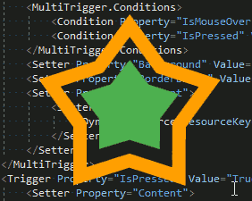
Here is the XAML code:
<Style x:Key="CustomButtonStyle" TargetType="{x:Type Button}">
    <Setter Property="Content">
        <Setter.Value>
            <DynamicResource ResourceKey='styleNormal' />
        </Setter.Value>
    </Setter>
    <Setter Property="Template">
        <Setter.Value>
            <ControlTemplate TargetType="{x:Type Button}">
                <Border Background="{TemplateBinding Background}" BorderBrush="{x:Null}" BorderThickness="0">
                    <ContentPresenter HorizontalAlignment="Center" VerticalAlignment="Center"/>
                </Border>
            </ControlTemplate>
        </Setter.Value>
    </Setter>
    <Style.Triggers>
        <MultiTrigger>
            <MultiTrigger.Conditions>
                <Condition Property="IsMouseOver" Value="True" />
                <Condition Property="IsPressed" Value="False" />
            </MultiTrigger.Conditions>
            <Setter Property="Background" Value="{x:Null}" />
            <Setter Property="BorderBrush" Value="{x:Null}" />
            <Setter Property="Content">
                <Setter.Value>
                    <DynamicResource ResourceKey='styleActive' />
                </Setter.Value>
            </Setter>
        </MultiTrigger>
        <Trigger Property="IsPressed" Value="True">
            <Setter Property="Content">
                <Setter.Value>
                    <DynamicResource ResourceKey='stylePressed' />
                </Setter.Value>
            </Setter>
        </Trigger>
        <Trigger Property="IsEnabled" Value="False">
            <Setter Property="Content">
                <Setter.Value>
                    <DynamicResource ResourceKey='styleDisabled' />
                </Setter.Value>
            </Setter>
        </Trigger>
    </Style.Triggers>
</Style>
Here we use DynamicResource for the button content. We defined four possible ResourceKeys, one for each button state.
The usage of the above defined style is also pretty simple:
<Button Width="200" Height ="190" Background="{x:Null}" BorderBrush="{x:Null}" Style="{StaticResource CustomButtonStyle}" >
    <Button.Resources>
        <Grid x:Key="styleNormal">
            <Path Fill="NORMAL_COLOR" Data="PATH_DATA" Stretch="Fill" />
        </Grid>
        <Grid x:Key="styleActive">
            <Path Fill="ACTIVE_COLOR" Data="PATH_DATA" Stretch="Fill" />
        </Grid>
        <Grid x:Key="stylePressed">
            <Path Fill="PRESSED_COLOR" Data="PATH_DATA" Stretch="Fill" />
        </Grid>
        <Grid x:Key="styleDisabled">
            <Path Fill="DISABLED_COLOR" Data="PATH_DATA" Stretch="Fill" />
        </Grid>
    </Button.Resources>
</Button>
The complete source code of this example you can download here, it shows a transparent window with a transparent button in it.
Let’s look again at the picture I posted at the very beginning:
It is a button with both outer and inner stars and the gap between them. By default you can click only on opaque parts of the content, which is totally fine and is exactly what we expect from transparent buttons, but in some cases we might want to react also on clicks on the transparent gap. The trick here is to specify some color instead of a pure "Transparent". In my case Fill="#01000000" did the trick. It provides almost full transparency but does not allow mouse clicks to fall through the button.