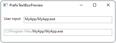
Quite often standard GUI components are missing some really awesome features or, what makes things even more complicated, these awesome features can not be implemented as a simple extension of the component. For example, imagine a text input field, which has a fixed part at the beginning (let’s call it prefix) and user-editable part at the end. Let’s say, for entering a path in some predefined folder.

This can be achieved in two ways: First, we can extend a RichTextBox component, which gives a possibility to apply some font properties to certain parts of the text. The implementation seems to be staightforward, but there are many side effect which negate all positive expectations:
- We have to carefully override an
OnPreviewKeyDownhandler, in particular check there forBackspaceandDelbuttons - We have to take care about
OnSelectionChangedhandler, adjusting it on the fly to the user-editable part - RichTextBox does not have a simple access to the text subcomponents by index, we have to use a
TextPointerinstead.
Of course, I tried to do it and even succeeded with it, but after half an hour of stress testing I was still able to accidentally delete the styling of the user-editable part. Taking into account the complexity of the code I came up with a much simpler and reliable solution: take several standard components and make Frankenstein out of them.
The idea is simple:
- Use a big read-only
TextBoxwithout any text as a background for our component. - Cover left part of the background with a
TextBlock, which will contain the prefix. - Cover the rest with a
TextBox
Of course, both prefix and a user-editable TextBox should not have any borders or background.
<UserControl x:Class="SlAlex.PrefixTextBox"
             xmlns="http://schemas.microsoft.com/winfx/2006/xaml/presentation"
             xmlns:x="http://schemas.microsoft.com/winfx/2006/xaml"
             xmlns:mc="http://schemas.openxmlformats.org/markup-compatibility/2006"
             xmlns:d="http://schemas.microsoft.com/expression/blend/2008"
             x:Name="parent"
             mc:Ignorable="d"
             d:DesignHeight="23" d:DesignWidth="200">
    <Grid DataContext="{Binding ElementName=parent}">
        <Grid.ColumnDefinitions>
            <ColumnDefinition Width="Auto"/>
            <ColumnDefinition Width="*"/>
        </Grid.ColumnDefinitions>
        <TextBox Grid.Column="0" Grid.ColumnSpan="2" HorizontalAlignment="Stretch" Margin="0,0,0,0" TextWrapping="Wrap" IsReadOnly="True" VerticalAlignment="Stretch" />
        <TextBlock Grid.Column="0" Text="{Binding Path=Prefix}" Foreground="#FF9C9C9C" HorizontalAlignment="Left" Margin="5,0,0,0" VerticalAlignment="Stretch"/>
        <TextBox Grid.Column="1" Text="{Binding Path=Text, Mode=TwoWay, UpdateSourceTrigger=PropertyChanged}" Padding="-2,0,0,0" BorderThickness="0" TextAlignment="Left" HorizontalAlignment="Stretch" Margin="0,0,0,0" TextWrapping="NoWrap" VerticalAlignment="Stretch" Background="{x:Null}" BorderBrush="{x:Null}" />
    </Grid>
</UserControl>
The implementation part for the component is very simple, take care about DependencyProperty, the binding will not work without it.
    /// <summary>
    /// Interaction logic for PrefixTextBox.xaml
    /// </summary>
    public partial class PrefixTextBox : UserControl
    {
        /// <summary>
        /// Gets or sets the Prefix
        /// </summary>
        public string Prefix
        {
            get => (string)GetValue(PrefixProperty);
            set => SetValue(PrefixProperty, value);
        }

        /// <summary>
        /// Prefix dependency property
        /// </summary>
        public static readonly DependencyProperty PrefixProperty =
            DependencyProperty.Register("Prefix", typeof(string),
              typeof(PrefixTextBox), new PropertyMetadata(""));

        /// <summary>
        /// Gets or sets the Text
        /// </summary>
        public string Text
        {
            get => (string)GetValue(TextProperty);
            set => SetValue(TextProperty, value);
        }

        /// <summary>
        /// Text dependency property
        /// </summary>
        public static readonly DependencyProperty TextProperty =
            DependencyProperty.Register("Text", typeof(string),
              typeof(PrefixTextBox), new PropertyMetadata(""));

        public PrefixTextBox()
        {
            InitializeComponent();
        }
    }
The usage of the component is also pretty staightforward:
<Window x:Class="PrefixTextBox.MainWindow"
        xmlns="http://schemas.microsoft.com/winfx/2006/xaml/presentation"
        xmlns:x="http://schemas.microsoft.com/winfx/2006/xaml"
        xmlns:d="http://schemas.microsoft.com/expression/blend/2008"
        xmlns:mc="http://schemas.openxmlformats.org/markup-compatibility/2006"
        xmlns:slalex="clr-namespace:SlAlex"
        mc:Ignorable="d"
        Title="PrefixTextBoxPreview" Height="150" Width="400">
    <Grid>
        <Grid.ColumnDefinitions>
            <ColumnDefinition Width="Auto"/>
            <ColumnDefinition Width="*"/>
        </Grid.ColumnDefinitions>
        <Grid.RowDefinitions>
            <RowDefinition Height="*" />
            <RowDefinition Height="*" />
        </Grid.RowDefinitions>
        <TextBlock Grid.Row="0" Height="23" Grid.Column="0" Text="User input:" HorizontalAlignment="Right" Margin="10,0,0,10" VerticalAlignment="Bottom" />
        <TextBox IsReadOnly="True" Grid.Row="0" Height="23" Grid.Column="1" Text="{Binding Path}" HorizontalAlignment="Stretch" Margin="10,0,10,10" VerticalAlignment="Bottom"/>
        <slalex:PrefixTextBox Grid.Row="1" Grid.ColumnSpan="2" Height="23" VerticalAlignment="Top" Margin="10" Prefix="C:/Program Files/" Text="{Binding Path, Mode=TwoWay, UpdateSourceTrigger=PropertyChanged}" />
    </Grid>
</Window>
The complete source code of this example you can download here, it shows a small window with our custom input on the bottom and a binded TextBox on top, which mirrors the user input:

Feel free to use it as an example in your composite user controls.